Projects Overview
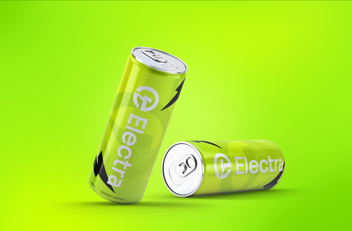
The “Electra” brand identity captures the essence of energy and excitement, aligning perfectly with its purpose as an energizing drink aimed at thrill-seekers, go-getters, and game-changers. The bold, electrifying color scheme of neon green signifies vitality and power, drawing attention and evoking a sense of freshness and intensity.
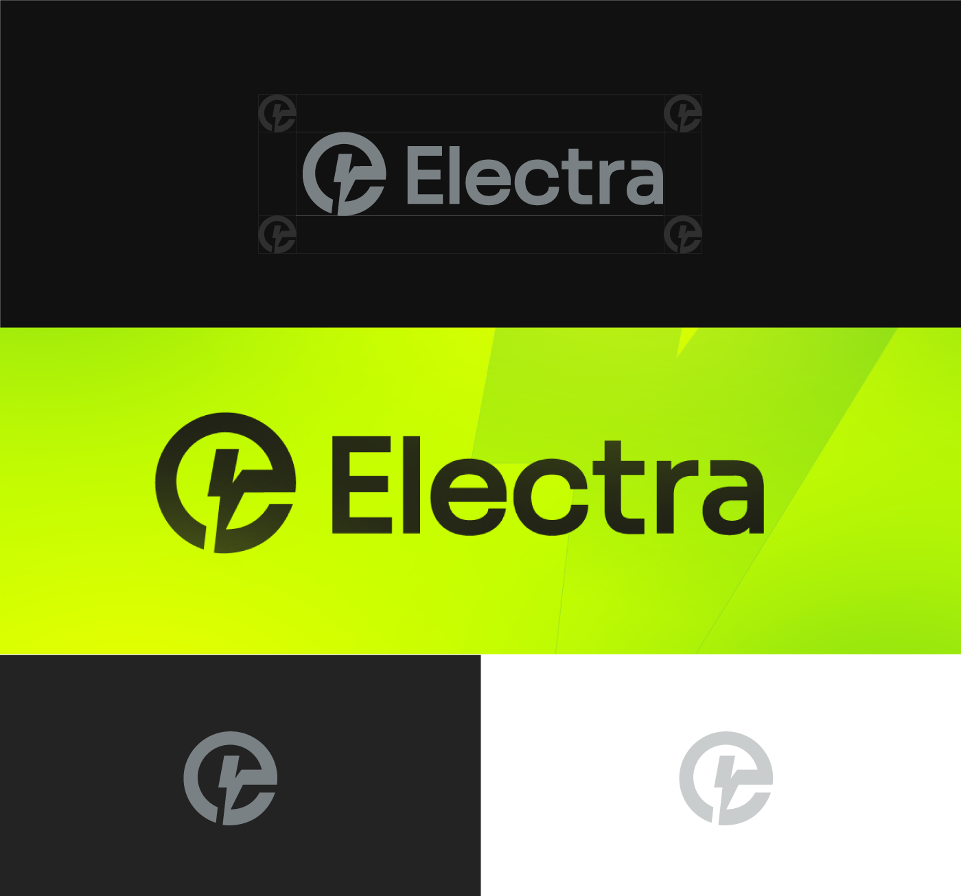
The logo design, with its dynamic, lightning-inspired icon, embodies a spark of energy in every can, reinforcing the brand’s promise to “ignite your spark.”
The “Electra” brand identity captures the essence of energy and excitement, aligning perfectly with its purpose as an energizing drink aimed at thrill-seekers, go-getters, and game-changers. The bold, electrifying color scheme of neon green signifies vitality and power, drawing attention and evoking a sense of freshness and intensity.

Projects Solution
The clean, modern typography complements the symbol, creating a cohesive and powerful identity that’s instantly recognizable. Whether on a sleek black background or in vibrant green, the Electra logo stands out, making a strong statement that energizes and motivates consumers.

