Electra.
A bold brand identity built to ignite your spark, designed for thrill-seekers, go-getters, and game-changers who want their energy drink to look as electric as it feels.
What Makes It Work
Color & Energy
A bold neon green built to signal vitality and power, drawing attention and evoking freshness and intensity.
Logo Symbol
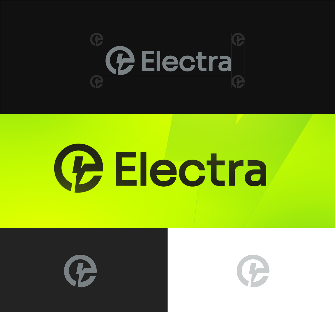
A dynamic, lightning-inspired icon that embodies a spark of energy in every can.
Typography
Clean, modern type that complements the symbol for a cohesive, instantly recognizable identity.
Brand Tone
An energizing brand voice aimed squarely at thrill-seekers, go-getters, and game-changers.
Igniting the Spark
The Electra brand identity captures the essence of energy and excitement, aligning perfectly with its purpose as an energizing drink aimed at thrill-seekers, go-getters, and game-changers. The bold, electrifying color scheme of neon green signifies vitality and power, drawing attention and evoking a sense of freshness and intensity.
The logo design, with its dynamic, lightning-inspired icon, embodies a spark of energy in every can, reinforcing the brand's promise to "ignite your spark."
The clean, modern typography complements the symbol, creating a cohesive and powerful identity that's instantly recognizable. Whether on a sleek black background or in vibrant green, the Electra logo stands out, making a strong statement that energizes and motivates consumers.
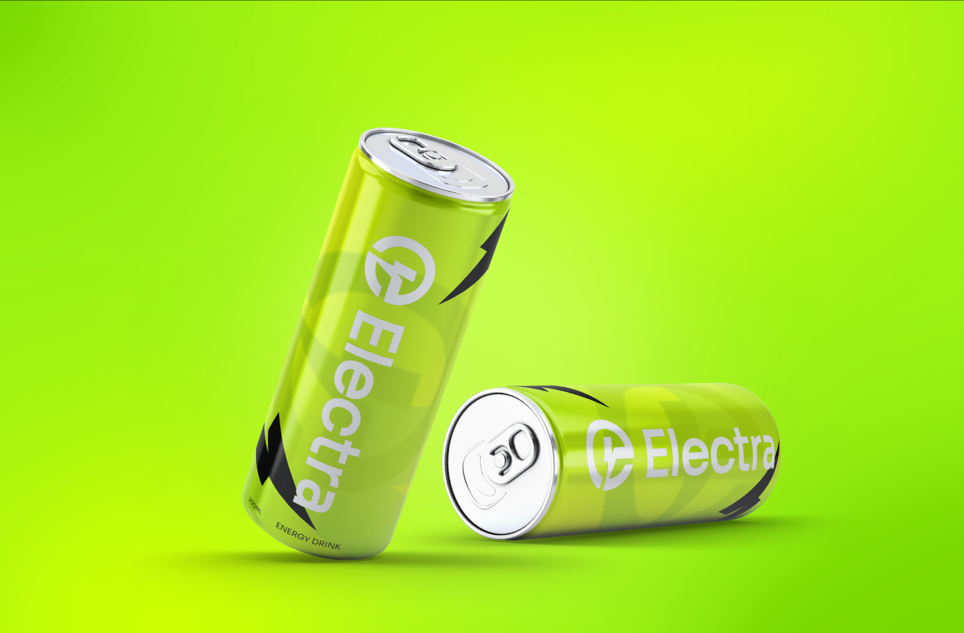
The Identity in Action