Design
Product-First Design
Every layout puts the product front and center, high-quality visuals and clean typography that give shoppers the confidence to buy.

A fast-growing footwear brand came to HK Tech Hub with a website that couldn't keep pace with its product line. A complete e-commerce rebuild turned casual browsers into buyers, lifting organic traffic by 142% and conversions by 108.52%.
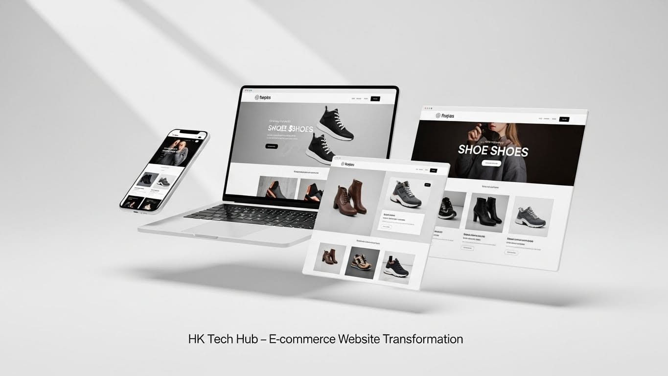
A clean, product-first interface built around high-quality visuals, strong typography, and mobile-first navigation.
Every product page refined for a smoother path from browsing to checkout, with clear CTAs and trust-building details.
Code, images, and page structure optimized to cut load times and strengthen mobile scores across the board.
CTA placement and page layout tested and refined so more visitors took action instead of leaving.
This footwear brand had outgrown the website supporting it. As the product line expanded and traffic grew, the existing site struggled to keep up, held back by outdated design, weak product presentation, and an ineffective navigation structure that made it hard for shoppers to find what they came for.
Slow-loading pages and a clunky mobile experience compounded the problem, quietly pushing potential buyers away before they ever reached checkout. HK Tech Hub rebuilt the platform from the ground up, pairing a modern, conversion-focused design with the performance and structure needed to support a scaling e-commerce business.
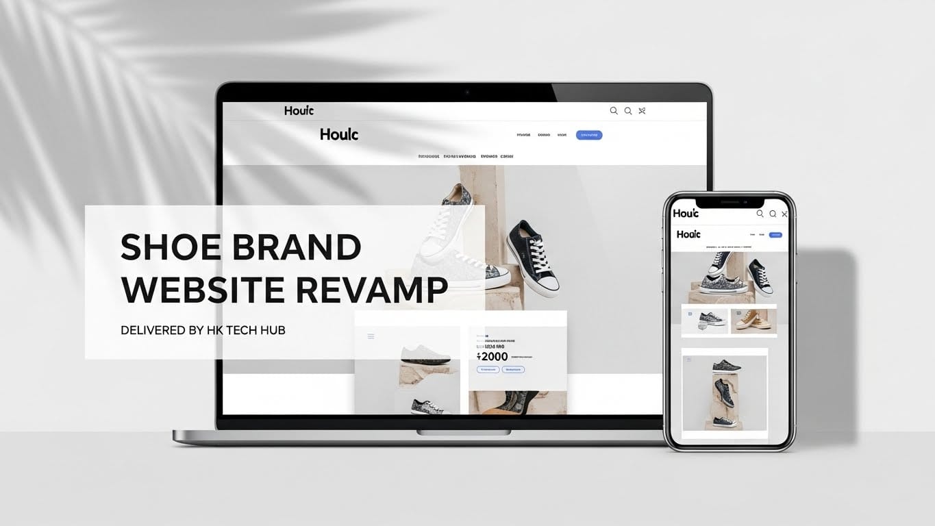
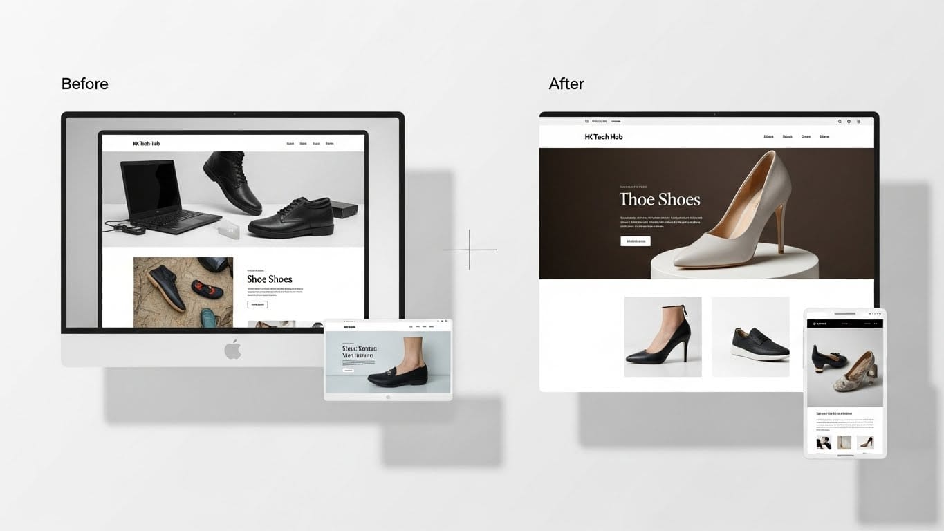
The old site's layout and weak product presentation didn't reflect the quality of the brand, leaving shoppers unimpressed before they had a chance to browse.
A clunky mobile layout paired with slow-loading pages meant most visitors, the majority of shoppers, were the ones hit hardest.
An ineffective navigation structure made it hard to find products, and a weak conversion path meant browsers rarely became buyers.
HK Tech Hub rebuilt the brand's website from the ground up, one connected system spanning design, e-commerce flow, performance, and conversion strategy, to turn a fast-growing product line into a fast-growing storefront.
The interface was rebuilt around a clean, product-first layout. High-quality product visuals, strong typography, and streamlined navigation gave the brand a modern look, while every screen was designed mobile-first to match how customers actually shop.
Product pages were enhanced with clearer calls-to-action, trust-building elements, and simpler size and variant selection. The cart and checkout flow was smoothed out so shoppers could move from browsing to purchase without friction.
Code, images, and site structure were optimized to cut page loading times, improve mobile scores, and strengthen SEO visibility, building the technical foundation the redesign needed to perform.
Improved product filtering, customer-focused layouts, and a simplified purchase path optimized the entire user journey, turning more visitors into paying customers.
A redesign only pays off when every layer supports it. These results held because design, performance, and conversion strategy were built together, not bolted on afterward.
Every layout puts the product front and center, high-quality visuals and clean typography that give shoppers the confidence to buy.
With most traffic arriving on mobile, faster load times and a smoother mobile layout met customers exactly where they shop.
A simplified cart and checkout path, with clearer variant selection, removed the drop-off points that were costing sales.
Traffic, leads, and conversions moved together, a 142% lift in organic traffic paired with a 108.52% jump in conversions reflects a site working at every stage of the funnel.