Trust
Purity Reflected in Every Detail
From the wordmark to the cap color, nothing was left to signal anything other than a safe, plant-based product.

GREENLINE needed an identity that speaks for itself before a customer reads a single word, one that carries the purity of natural, plant-based hair care from the logo through to the bottle in someone's hand.
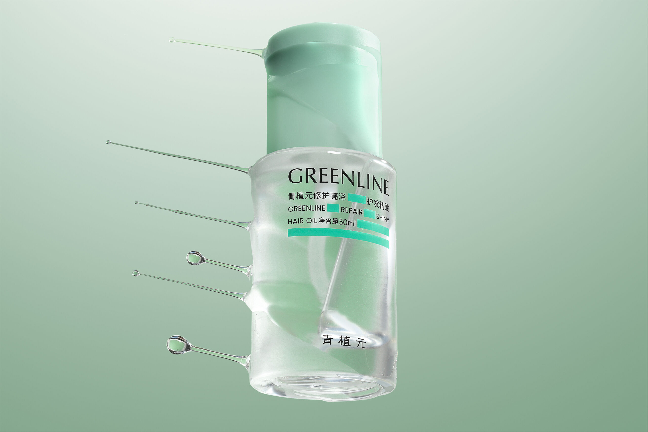
A minimalist, modern mark paired with a bold uppercase wordmark, built for clarity, trust, and premium quality.
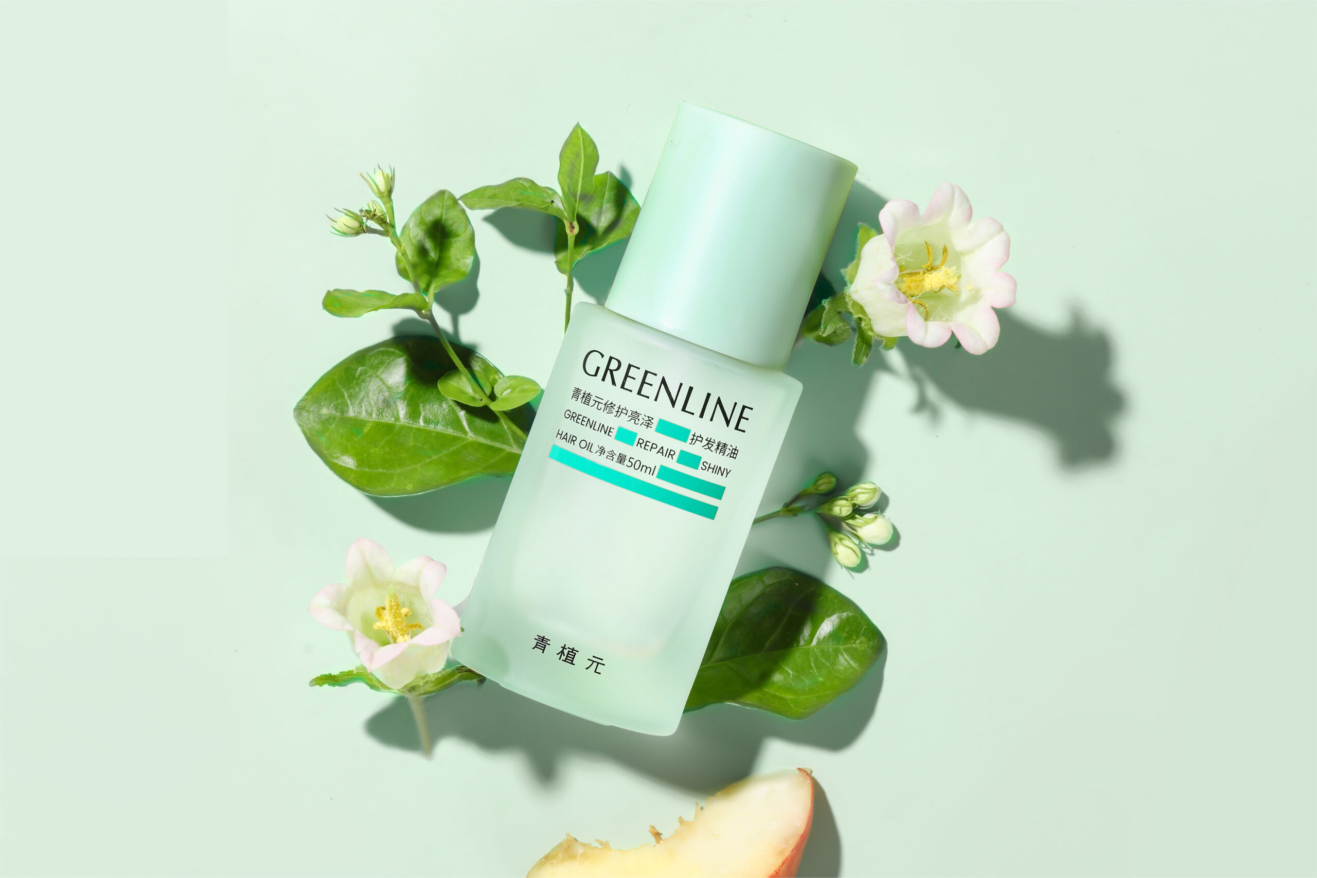
A refreshing pastel green rooted in nature and plant life, gentle on the eye and true to the product inside.
Product photography built around leaves and water droplets, bringing the organic ingredients to the surface.
A frosted glass bottle with a soft green cap, clean and luxurious, matching the brand's eco-conscious values.
For GREENLINE, the objective was to design an identity that highlights the brand's dedication to natural, plant-based solutions for hair care. The clean, sophisticated aesthetic reflects the purity and effectiveness of the product, appealing to shoppers who prioritize health, nature, and gentle care.
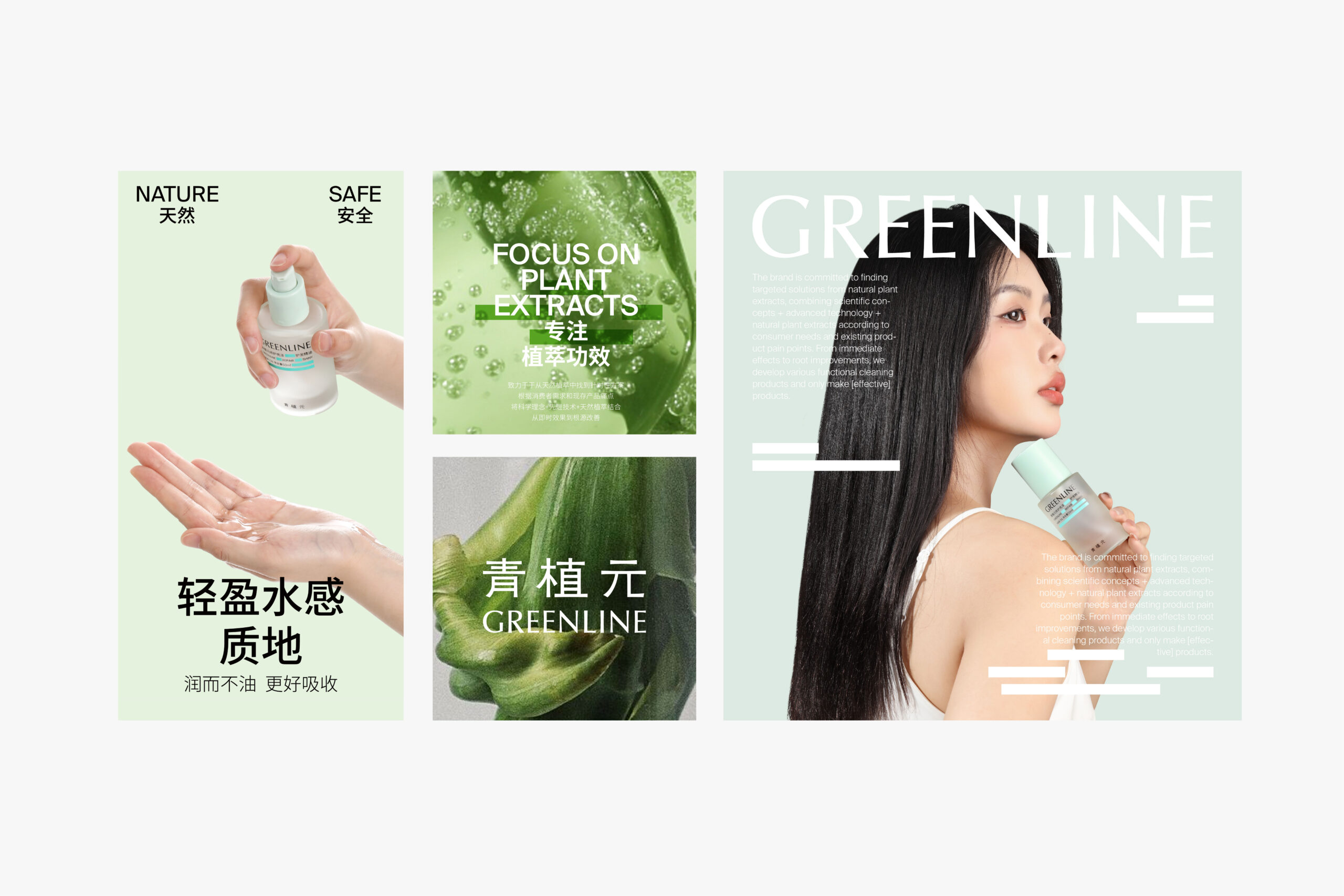
The minimalist, modern logo emphasizes clarity and elegance, while the bold uppercase font used for "GREENLINE" conveys trust and premium quality. A soft pastel green ties every touchpoint back to plant life, and product photography built around leaves and water droplets carries that same organic feeling through to packaging that speaks for the brand before a word is read.
The mark and wordmark needed to stay simple and modern while still reading as a trustworthy, premium product on the shelf.
Green is an easy default for "natural" brands, so the exact pastel tone had to feel gentle and specific to GREENLINE, not borrowed.
The bottle needed to look and feel as clean as the formula inside, without leaning on plastic or clutter to signal quality.
HK Tech Hub built GREENLINE's identity around four connected pillars, mark, color, imagery, and packaging, from the first discovery call through to the finished bottle.
HK Tech Hub started by mapping GREENLINE's plant-based promise, its target shopper, and how the brand needed to feel next to competitors on the shelf.
A minimalist, modern mark was paired with a bold uppercase wordmark, built to convey trust and premium quality at a glance.
A refreshing pastel green, inspired by nature and plant life, was chosen to be gentle on the eyes and reinforce the product's nourishing qualities.
Product photography was directed around leaves and water droplets, bringing the organic, plant-based ingredients to the surface of every image.
A frosted glass bottle with a soft green cap was designed for a clean, luxurious look that aligns with the brand's eco-conscious values.
Messaging like "Focus on Plant Extracts" and "Nature & Safe" was locked into the guidelines so every future touchpoint stays on-brand.
A natural-care brand has to look as gentle as its formula and still read as premium on the shelf. Getting that right meant treating mark, color, imagery, and packaging as one decision, not four.
From the wordmark to the cap color, nothing was left to signal anything other than a safe, plant-based product.
The minimalist logo and bold typography let the product's own quality do the talking, without visual noise.
The frosted glass bottle and soft green cap give GREENLINE a shelf presence that matches its eco-conscious promise.
Logo, palette, imagery, and packaging were built together, so the brand feels the same on a shelf as it does on screen.